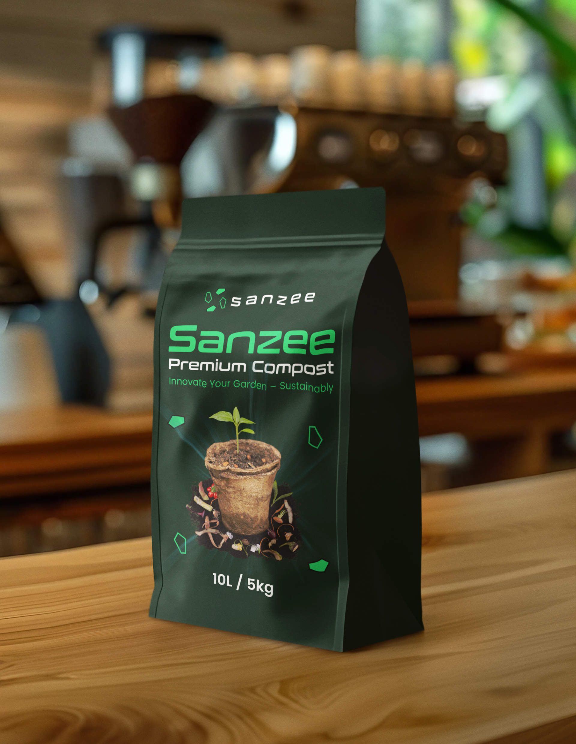
Sanzee logo, branding and packaging design
Do you have a project? Let's work together!
💌 alimdesignsbd@gmail.com
🚀 Website: www.alimdesigns.net
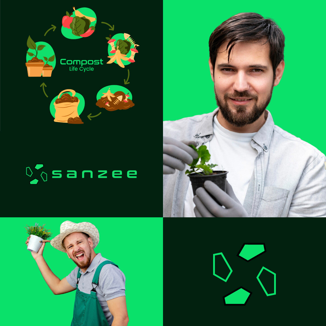
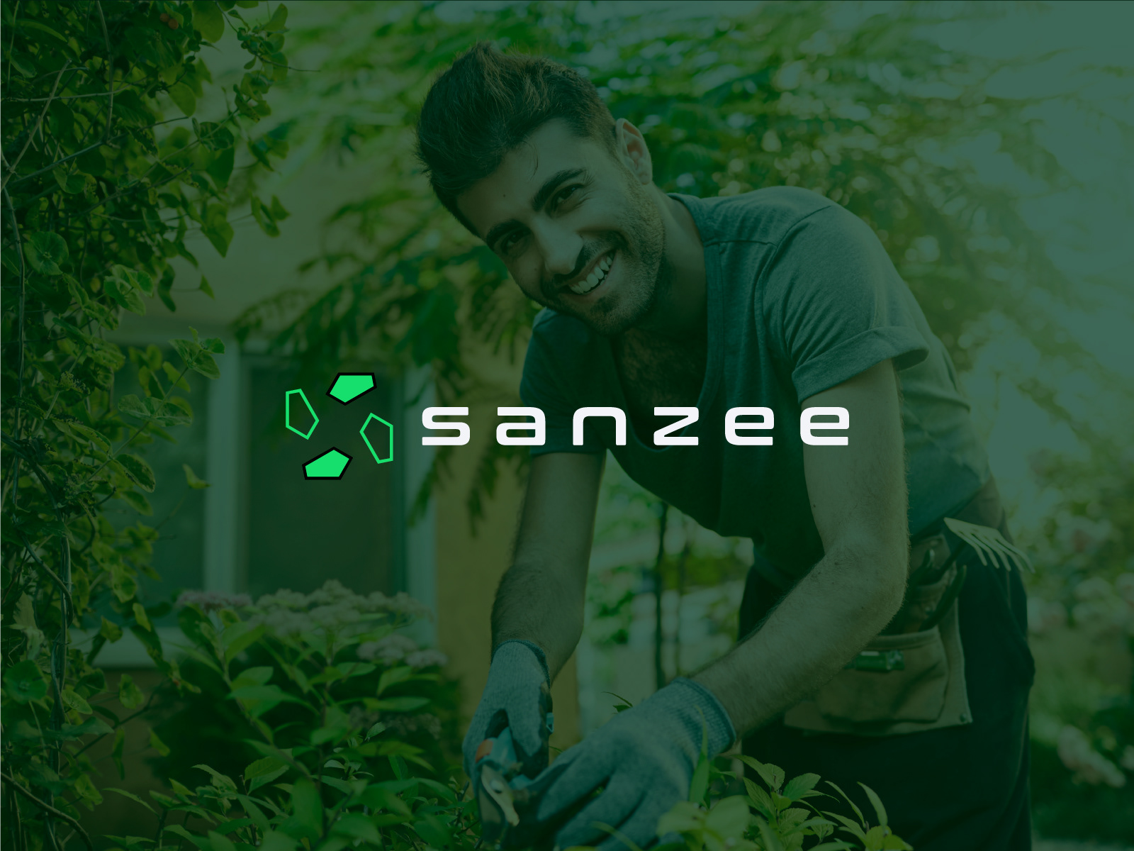
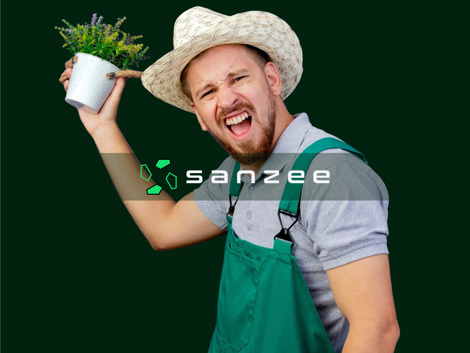
The branding of Sanzee, as seen in the images, revolves around sustainability, innovation, and gardening. Here’s how the visual elements contribute to the brand identity:
Core Theme:
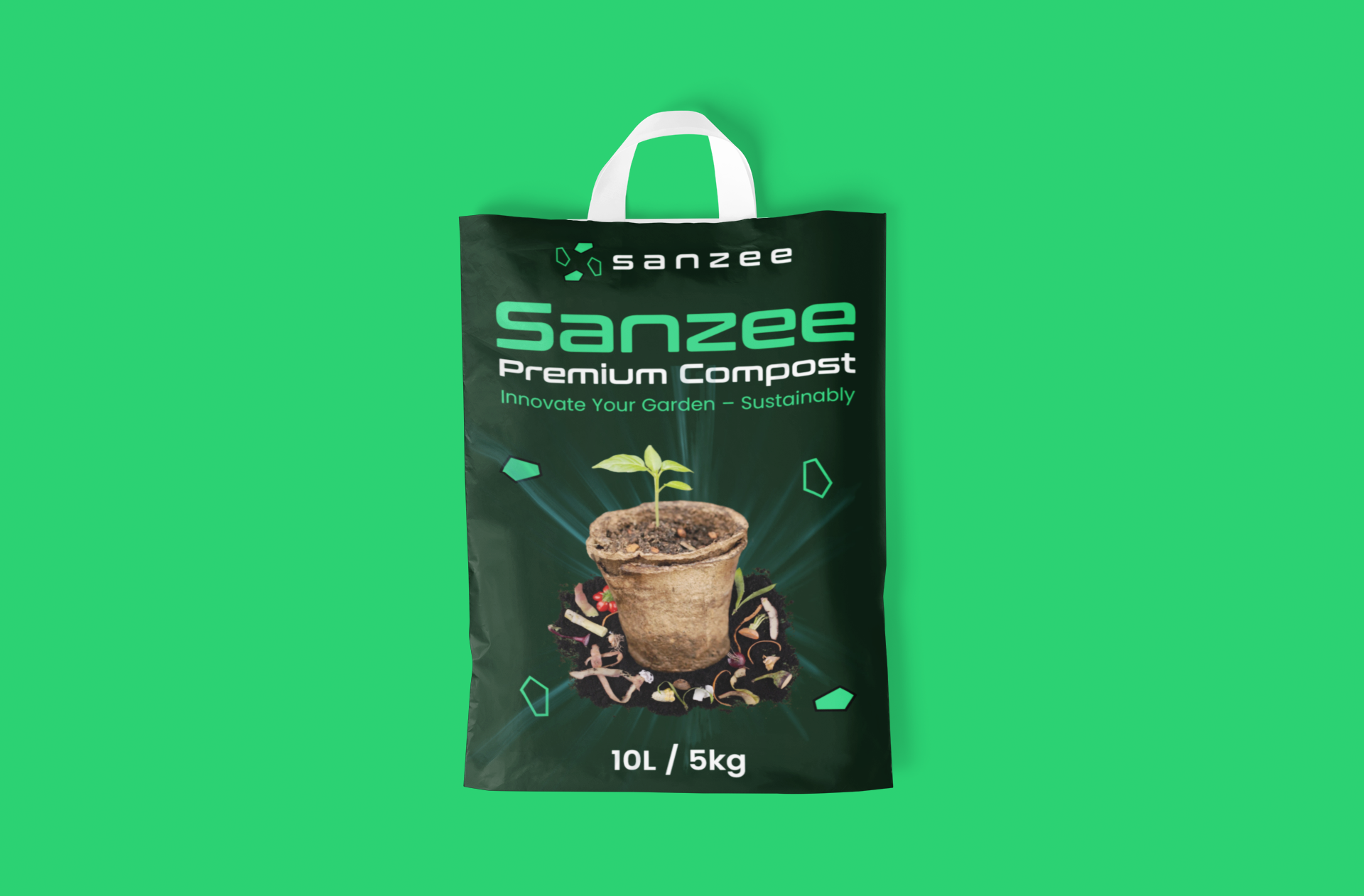
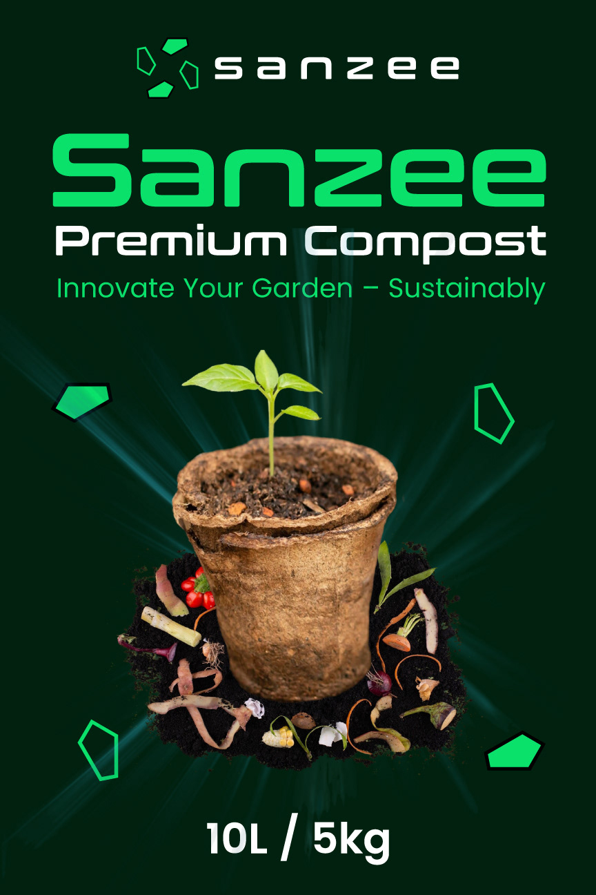
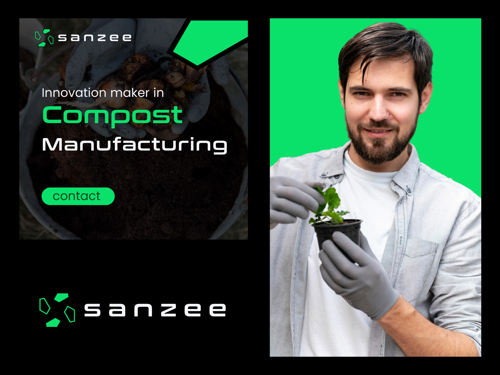
The tagline "Innovator in Compost Manufacturing" (seen in one of the images) indicates that Sanzee is likely a company that produces composting equipment, compost products, or related technology. The focus on composting aligns with sustainability and environmental responsibility.
Visual Consistency:
The neon green and black color scheme is consistent across all images, creating a cohesive brand identity.
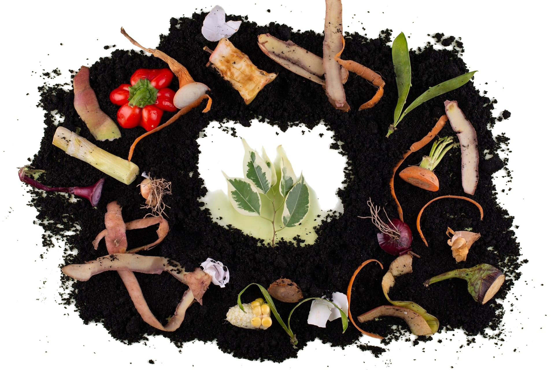
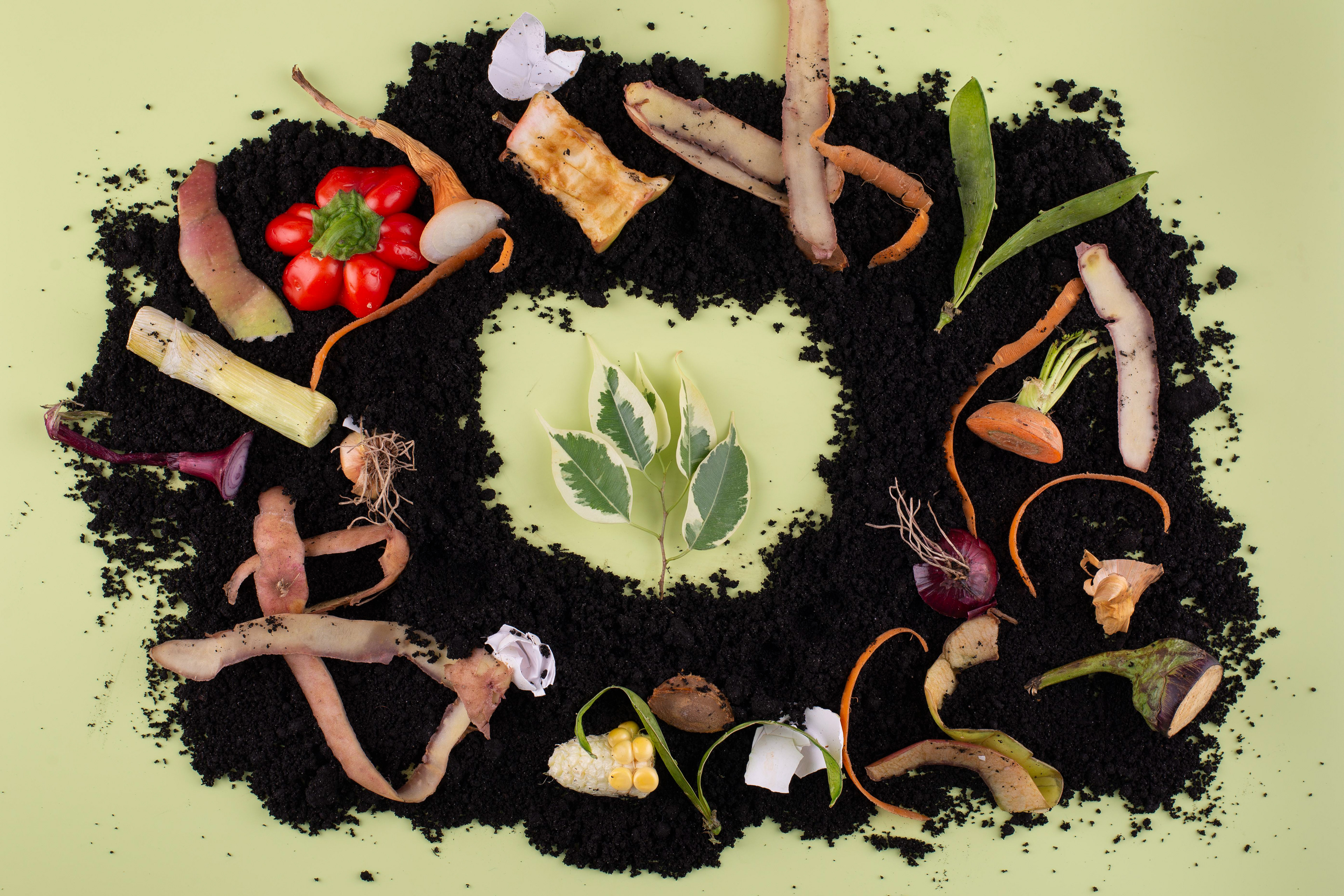
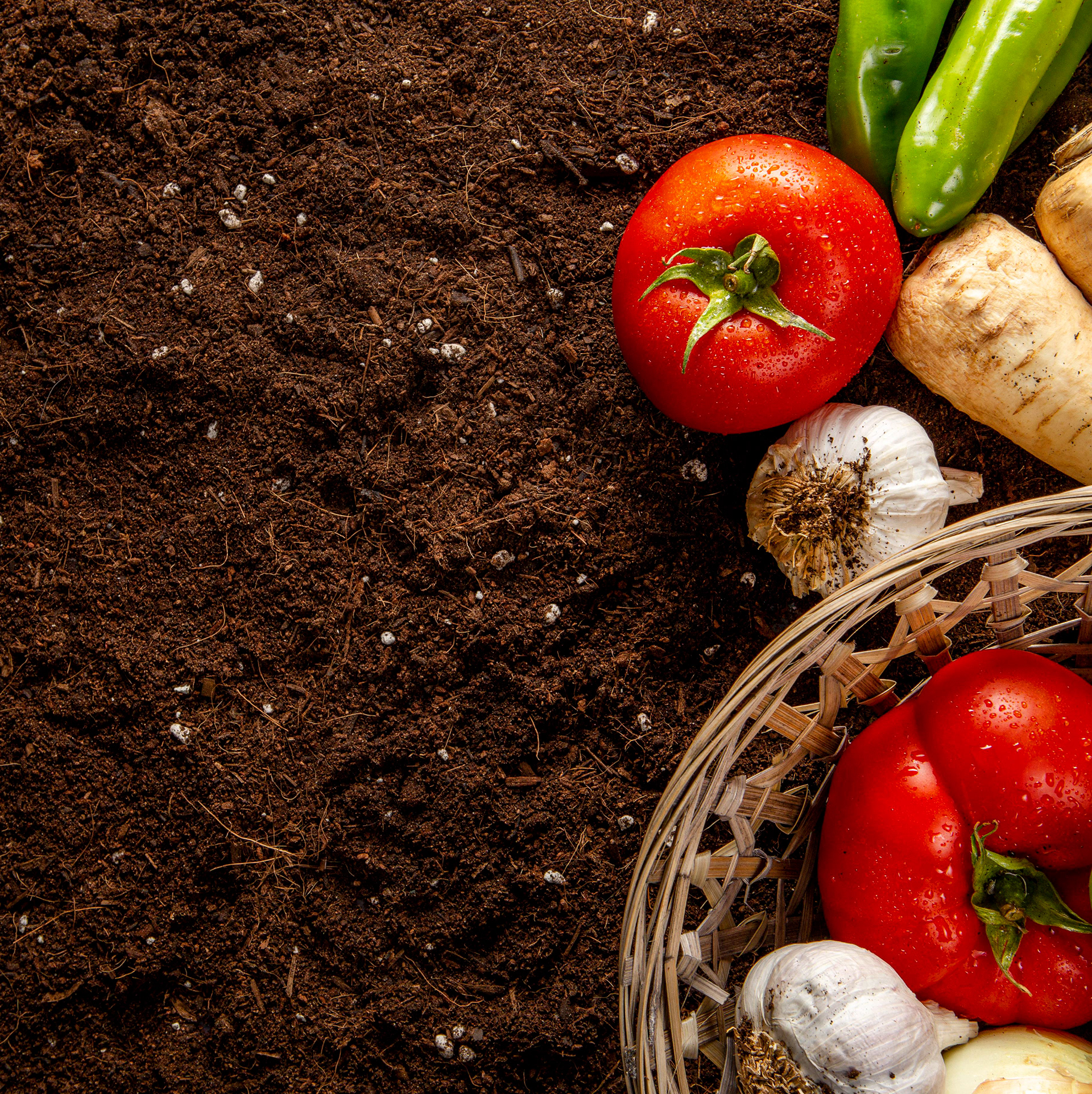
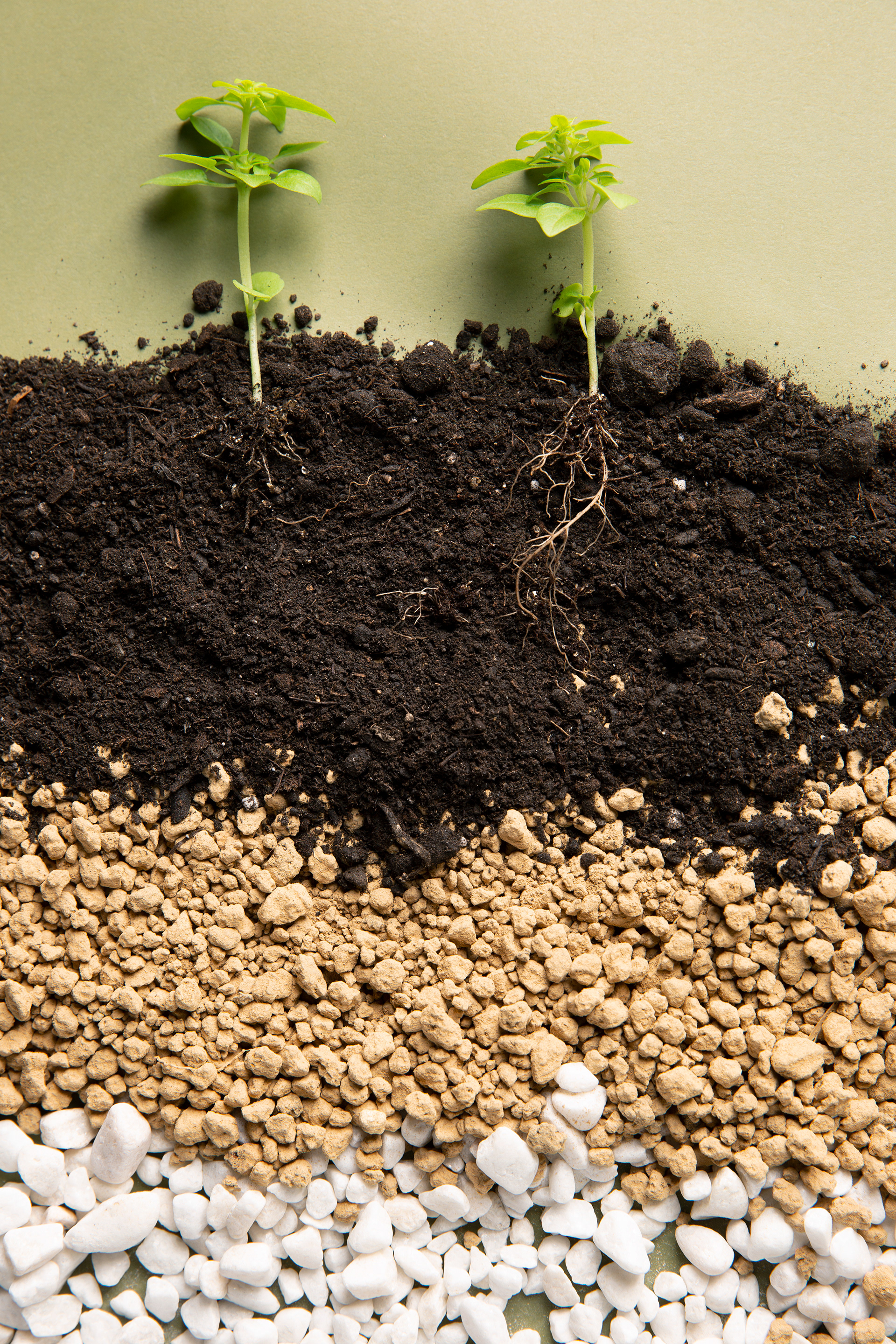
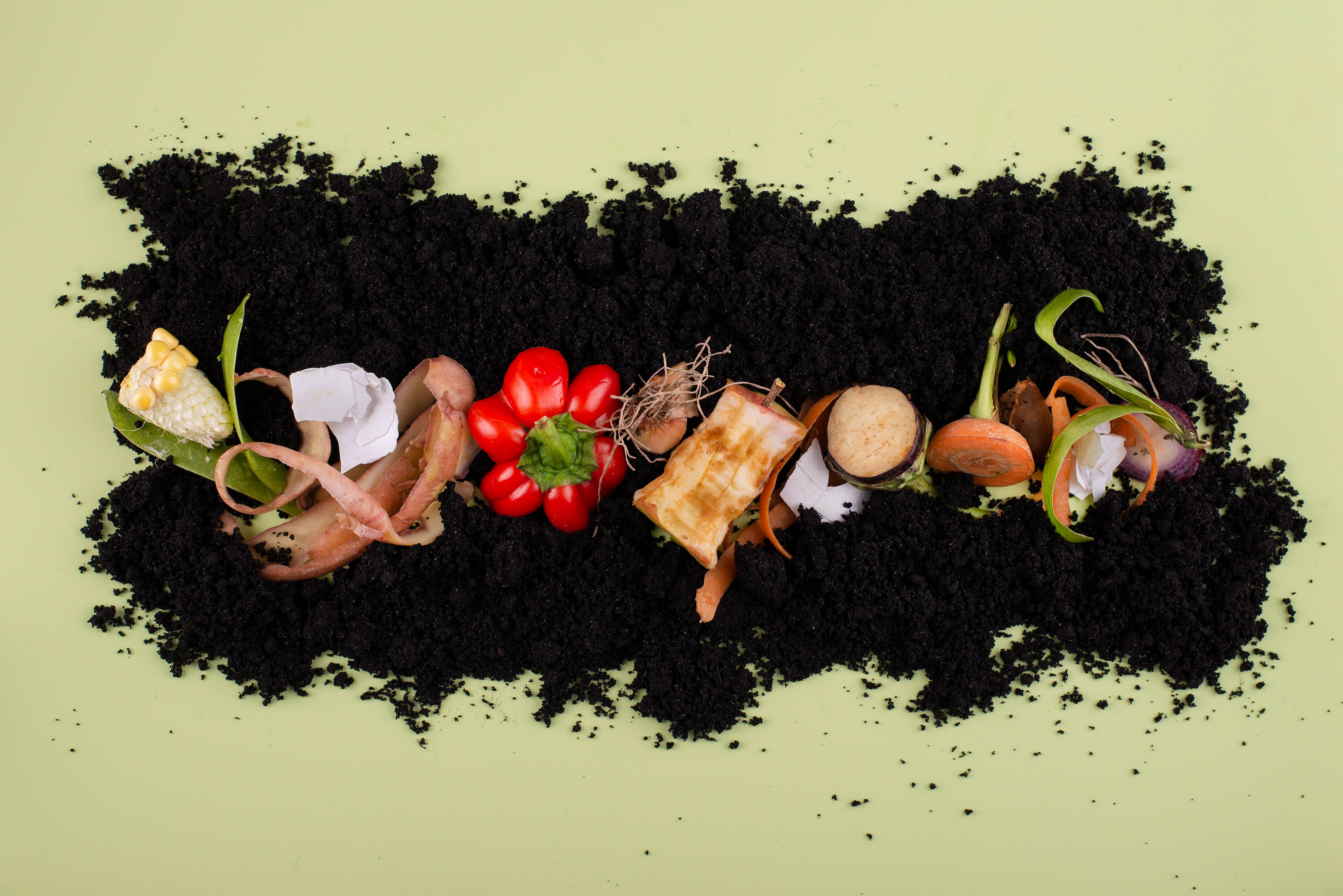
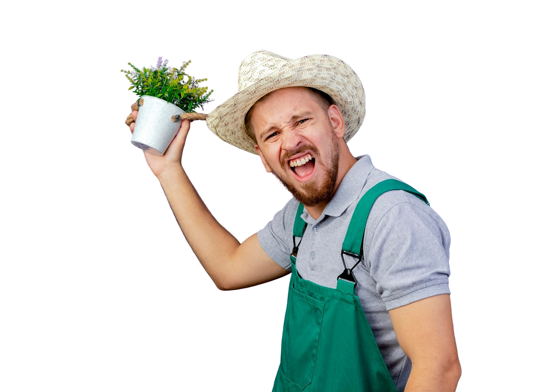
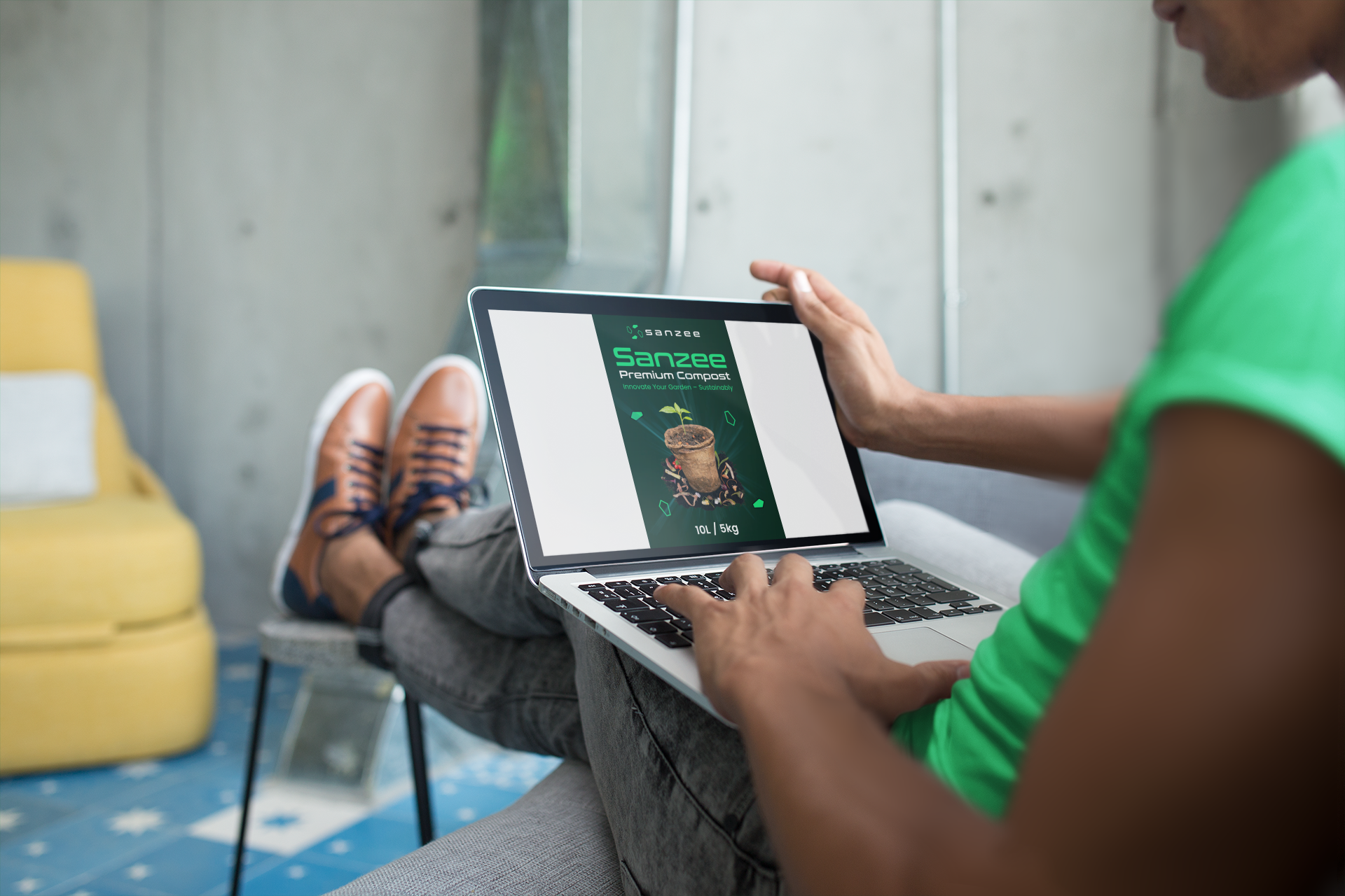
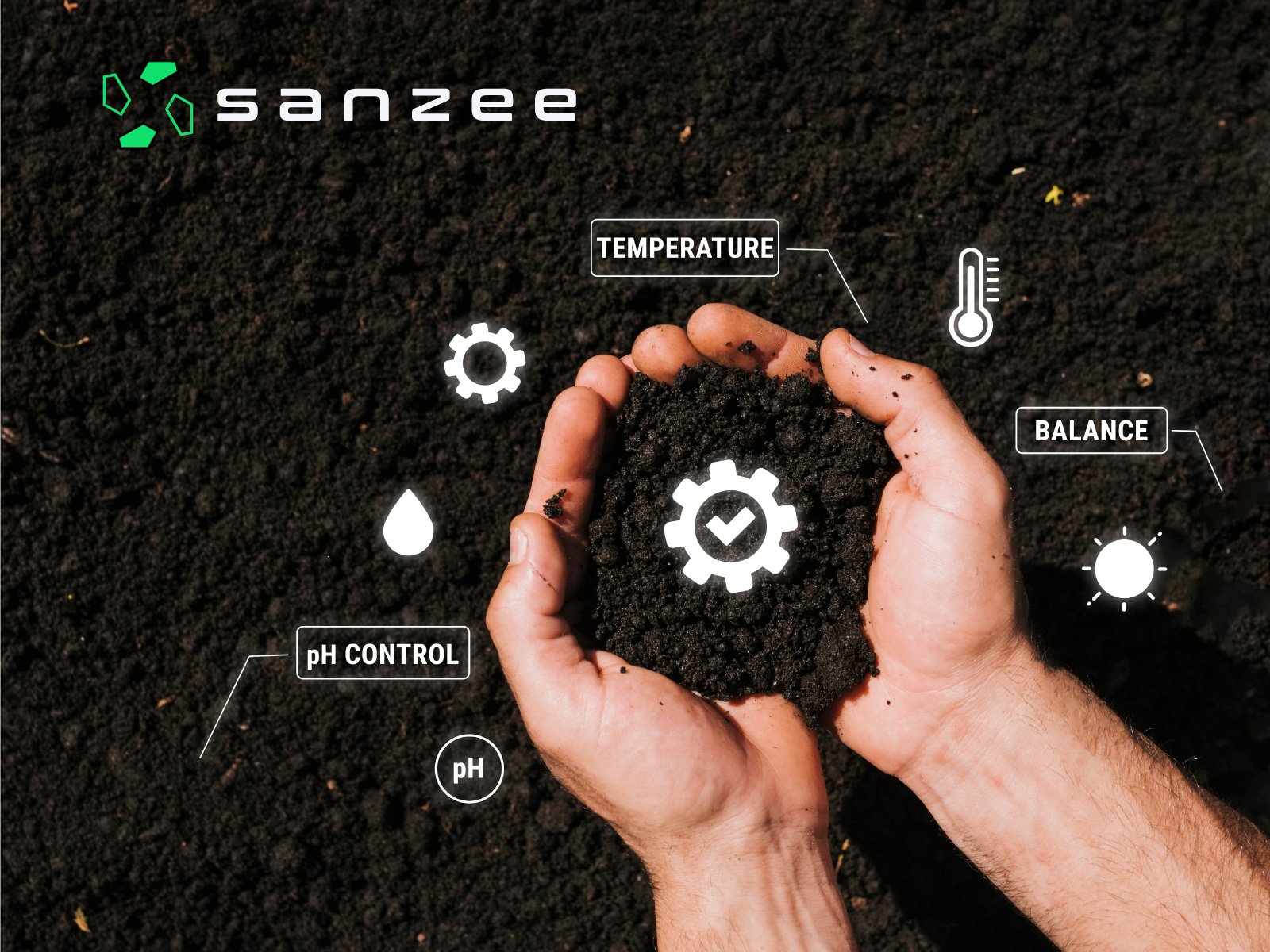
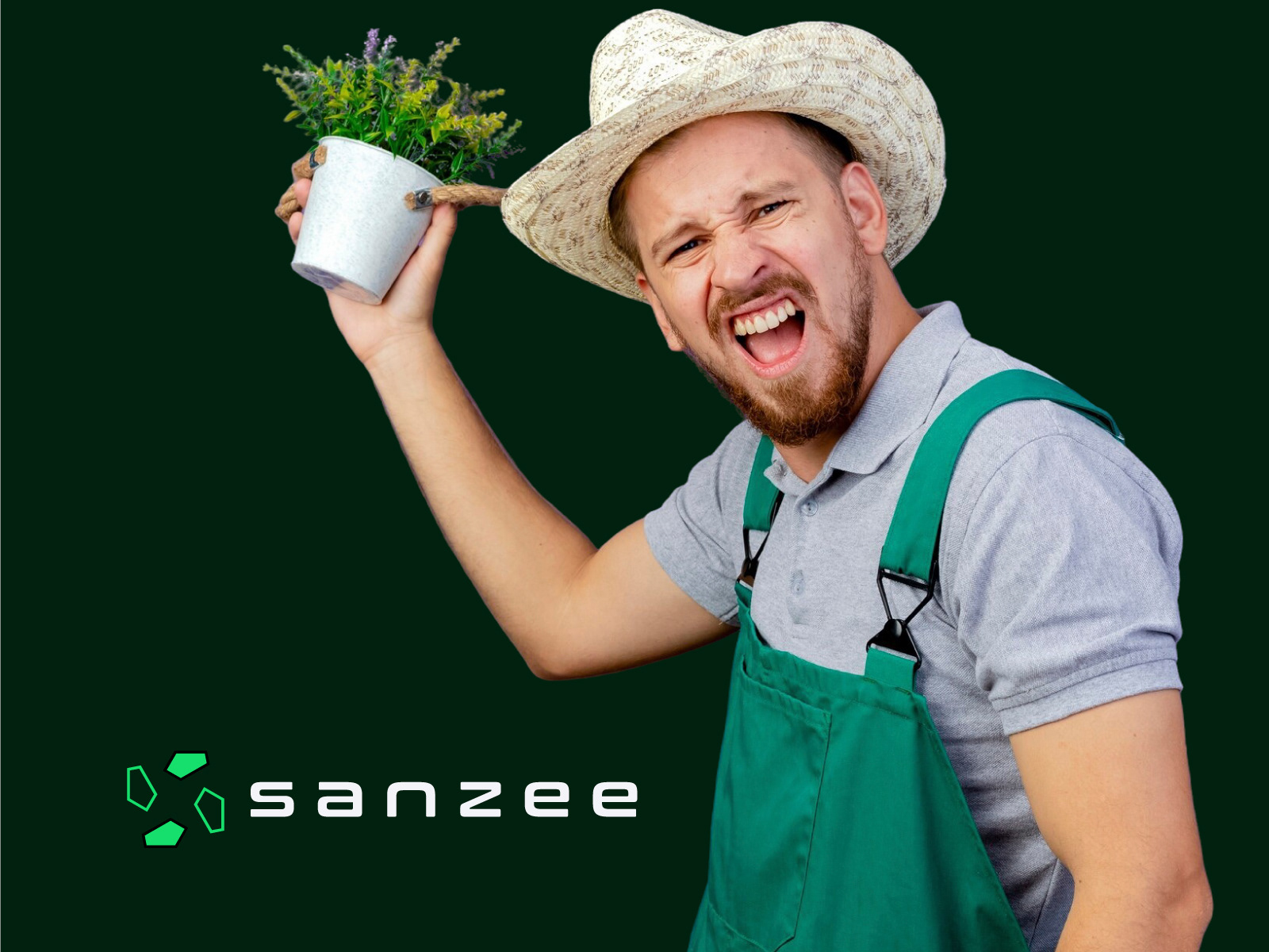
The use of gardening imagery (plants, soil, potted plants, and people gardening) reinforces the brand’s connection to nature and eco-friendly practices.
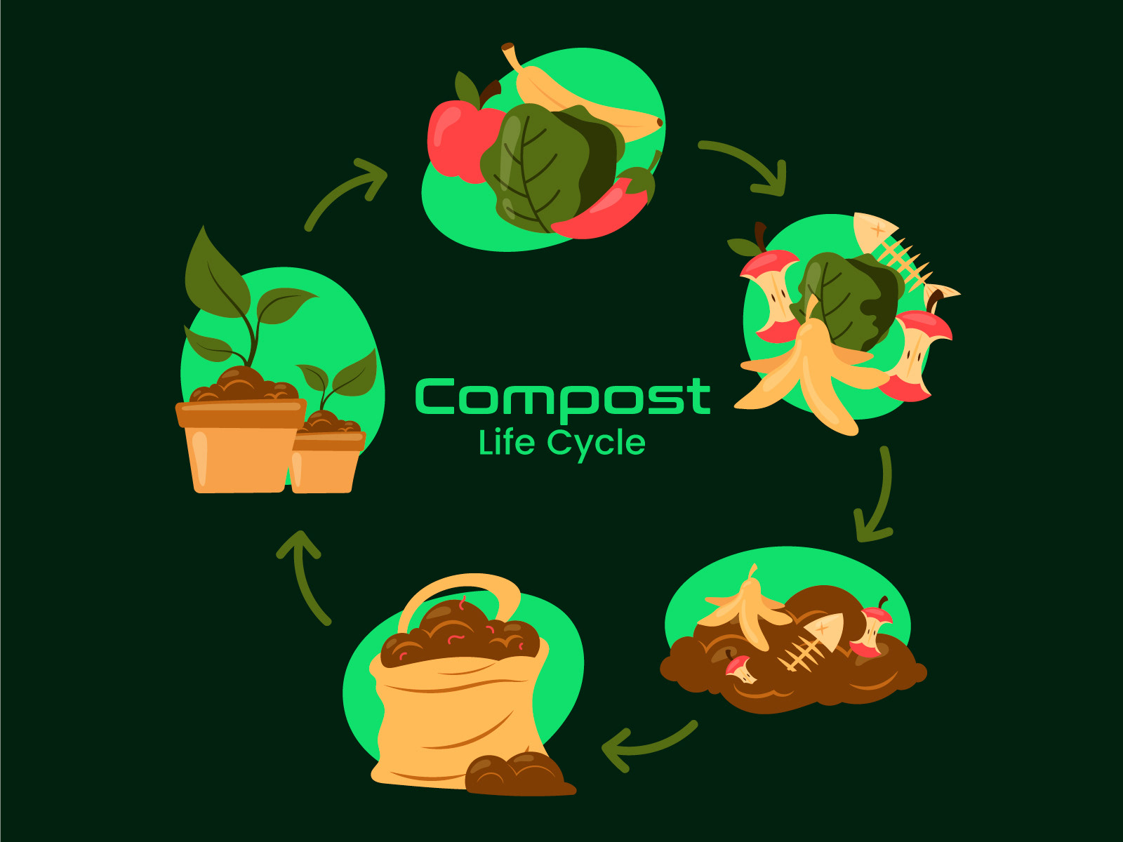
The "Compost Life Cycle" graphic in one of the images illustrates the composting process, emphasizing education and transparency—key values for a sustainability-focused brand.
Tone and Messaging:
The tone is a mix of professional and approachable. The modern design elements (geometric icon, sleek typography) suggest innovation, while the gardening imagery and friendly visuals (people smiling, holding plants) make the brand relatable to everyday gardeners and eco-conscious consumers.
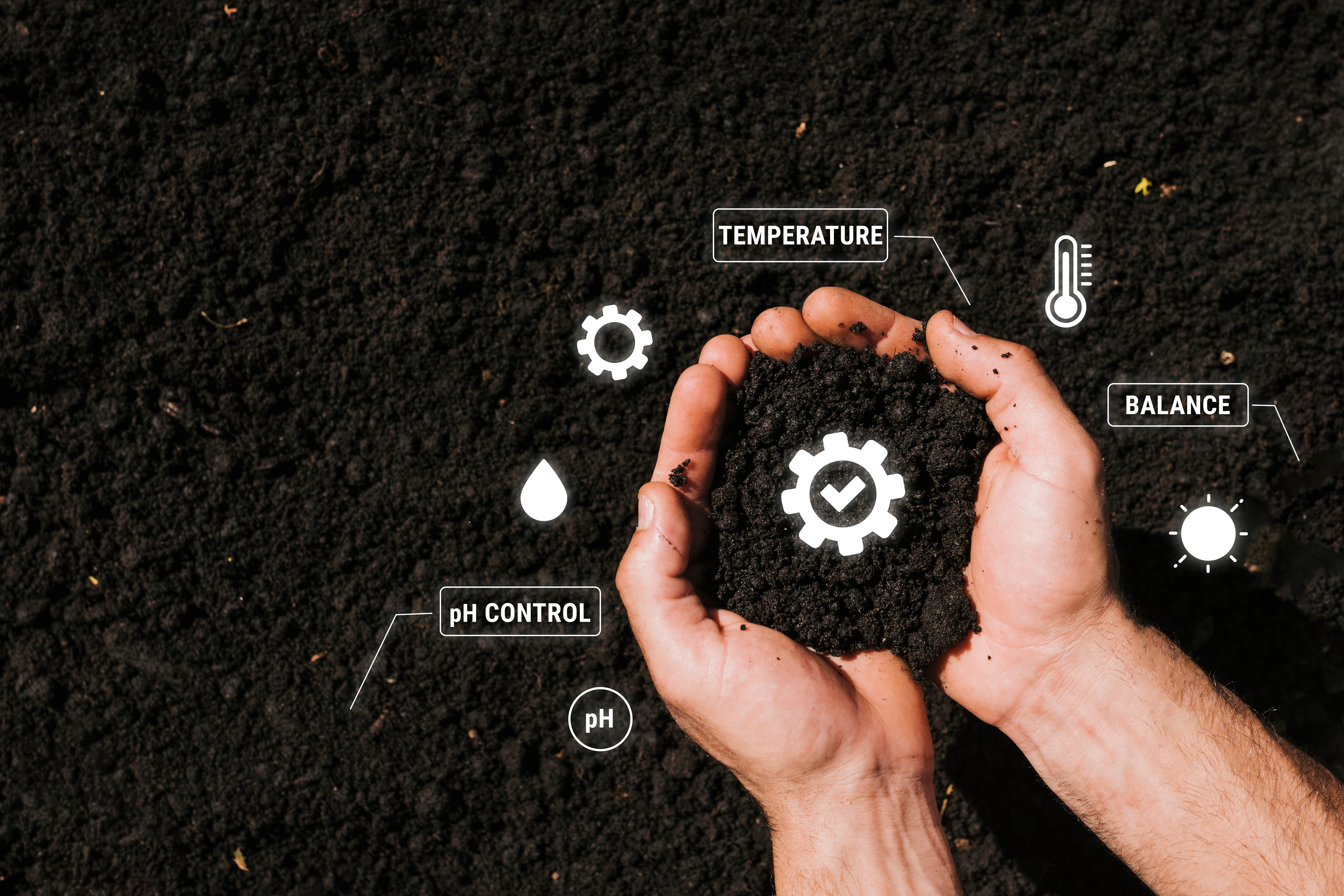
The use of terms like "pH Control," "Temperature," and "Balance" in one image suggests a scientific approach to composting, appealing to consumers who value precision and technology in their gardening practices.
Target Audience:
The branding targets eco-conscious individuals, home gardeners, and possibly small-scale farmers or businesses interested in sustainable waste management. The tech-forward design also suggests an appeal to younger, tech-savvy consumers who care about sustainability.