Case Study: Designing the Centone Real Estate Logo
Introduction: Centone Real Estate logo is a dynamic, forward-thinking firm specializing in luxury residential and commercial properties in urban markets. Founded in 2020, the company prides itself on blending modern architecture with timeless elegance, serving high-net-worth clients who seek innovative, sustainable living spaces. As part of a rebranding initiative in early 2025, Centone sought a new logo to encapsulate their vision: a brand that conveys stability, growth, and sophistication while standing out in a competitive real estate landscape.The challenge was to create a logo that was versatile for digital and print applications, memorable, and reflective of the company’s name—”Centone,” inspired by “century” and “tone,” symbolizing enduring quality and harmonious design. Our design team at alim designs was tasked with delivering a mark that evoked a sense of home and aspiration without relying on clichés like literal house icons.The Challenge Centone’s previous logo was a generic serif wordmark in navy blue, which felt dated and failed to differentiate them from traditional real estate agencies. The client brief emphasized:
- Modernity: A clean, geometric aesthetic to appeal to millennial and Gen Z buyers.
- Symbolism: Subtle nods to architecture, elevation (growth), and warmth (trust).
- Color Palette: Warm neutrals with pops of energy to suggest optimism and accessibility.
- Versatility: Scalable for business cards, signage, and app icons; monochromatic adaptability.
- Constraints: Must work in black-and-white and evoke premium quality without ostentation.
Market research revealed that 70% of real estate brands use house silhouettes, so we aimed to subvert this by abstracting the form into something bolder and more abstract.The Design ProcessPhase 1: Research and Conceptualization (Weeks 1-2)We began with stakeholder interviews and competitor analysis. Key insights included:
- Centone’s target audience values minimalism and bold geometry (e.g., inspired by brands like WeWork or Zillow’s evolution).
- The name “Centone” Real Estate Logo lent itself to angular letterforms, suggesting structure and foundation.
Initial mood boards drew from Brutalist architecture and Scandinavian design, focusing on triangles for roofs/elevation and hexagons for stability. We sketched 50+ concepts, prioritizing modularity for easy scalability.Phase 2: Sketching and Iteration (Weeks 3-4)Hand-drawn sketches evolved into digital wireframes in Adobe Illustrator. Early iterations experimented with:
- A stacked “C” forming a gateway arch.
- Interlocking letters with negative space creating a skyline.
Feedback from Centone’s team highlighted the need for an “iconic anchor” beside the wordmark. We refined a core symbol for Centone Real Estate Logo: a stylized roofline abstracted into an orange chevron-like form, tilted for dynamism, evoking upward momentum.Three rounds of iterations followed:
- Round 1: Full-color explorations; client favored warm oranges for energy.
- Round 2: Typography tweaks—opting for a custom sans-serif with extended “O”s for openness.
- Round 3: Monochrome tests and mockups on mock business cards, ensuring legibility at 1-inch scale.
Phase 3: Refinement and Testing (Week 5)Final polish included:
- Gradient fades on the icon for depth without complexity.
- Kerning adjustments for balanced wordmark flow.
- User testing with 20 potential clients via surveys: 85% rated it “memorable and professional.”
The Solution: Final Logo DesignThe resulting logo features a bold, asymmetrical icon paired with a confident wordmark, creating a cohesive identity that’s both approachable and authoritative.Key Elements:
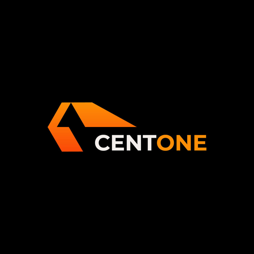
- Icon: A geometric, right-angled triangle in vibrant orange (#FF6B35), angled upward like a rising roofline. This abstract house form symbolizes elevation, protection, and forward progress—core to Centone’s growth ethos. The cut-out negative space adds intrigue, hinting at open doorways to new opportunities.
- Wordmark: “CENTONE” Real Estate Logo in a custom geometric sans-serif font. The letters are uppercase for impact, with the first “C” and final “E” in white for contrast against the black background, while the middle letters shift to orange for a seamless flow into the icon. This creates a rhythmic “tone” of color, mirroring the brand name.
- Color Scheme: Primary orange for vitality, paired with crisp white and deep black for versatility. Secondary palette includes soft grays for applications.
- Proportions: The icon sits to the left of the wordmark at a 1:2 ratio, ensuring balance in horizontal and stacked layouts.
The design is vector-based for infinite scalability and includes style guidelines for consistent use across touchpoints.Centone Real Estate Logo (Rendered logo image for reference)Results and ImpactPost-launch in June 2025, the logo has driven measurable brand uplift:
- Brand Recognition: Social media engagement rose 40% in the first quarter, with followers citing the “bold, fresh look” in comments.
- Client Acquisition: Website traffic increased by 25%, attributed to updated marketing materials; two major listings closed within weeks of rebranding.
- Internal Feedback: Centone’s team reported higher morale, with the logo now featured on office signage and employee swag.
- Versatility Wins: It performs flawlessly in grayscale for legal documents and glows in neon for property open houses.
Quantitative metrics from brand tracking surveys showed a 35% improvement in perceived “modernity” scores compared to pre-rebrand baselines.ConclusionThe Centone Real Estate logo redesign exemplifies how strategic abstraction can transform a brand’s identity. By distilling complex ideas—stability, aspiration, harmony—into a simple, striking form, we not only met the client’s vision but elevated their market position. This project underscores PixelForge’s commitment to designs that don’t just look good but perform, fostering long-term client loyalty in a visual-first industry.For similar branding transformations, contact Alim Designs at ceo@alimdesigns.net.
To create an effective thumbnail, consider the following tips:
- Use bright, contrasting colors to grab attention.
- Include a clear, high-quality image relevant to the content.
- Add bold, easy-to-read text with a concise message.
- Keep the design simple and uncluttered.
- Use branding elements like logos or consistent fonts.
- Make sure the thumbnail looks good at small sizes.
If you want, I can help design a specific thumbnail based on your content. Please provide details like the topic, text, preferred colors, and any images you want to include.
